2. How effective is the combination of your main product and ancillary texts?
ience picking the cast as i have incorporated images that we have taken when filming, it also gives it a homemade and vintage feel as Polaroid's aren't used very much due to the advancing technology. We feel that the Polaroid's support the laid back, low budget feel of the video as it was filmed in several houses, we didn't have any expensive clothing etc just like The Vaccines video itself and this style is carried throughout the 3 types of media. Although i have stated in other posts that we wanted to put our own modern spin on our video, opposed to The Vaccines, i didn't want this for the digi-pack as indie CD cases seem to say independent and unusual no matter what there music videos are like and i felt changing this would be going against that giving the audience a false pretense because of the music on the album. Although saying that the pictures throughout the album appear quite modern due to the props, such as the bedding etc, decor of the house and fancy dress custumes of the cast.
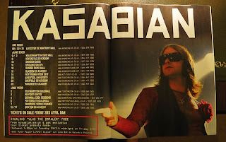
When designing the magazine advert i wanted to carry the Polaroid look on, so the video and CD were all consistent but i didn't want it to be completely the identical to the CD case as it would become boring, which i is why i added the lyrics into the 2 pages of the digipack, so to solve this i placed the pictures on top of each other to give it a lazy feel just like the video itself. I have used the same dymo tape font throughout the advert, CD case and insert which links them all well, even though i haven't use polaroid photos on the insert. Designing the magazine advert proved to be quite hard for me as i didn't want to bombard the audience with lots of information as i felt that magazines can be quite overwhelming with pictures and paragraphs of writing so i decided to keep it simple. I also felt adding such things like comments or reviews on the advert might of sold it better, but due to the font it would of been to overwhelming and would of covered the pictures. The advert and to some extent the CD case could sell the product on their indie basis. For example marketing in such magazine such as NME, a top indie magazine would make it sell better as people reading the magazine like that kind of music, rather then putting the advert into a magazine such as OK or Hello where it could of teenage girls and elder women.
No comments:
Post a Comment